Hey friend! Welcome to part three of the 4-part #InfoProductBiz series. In this series, I’m showing you the step-by-step process to creating and launching your first informational product, such as an e-book, e-course, or workshop. If you missed the first two posts in the series, then you best be catchin’ up, yo. You can check those out here:
1. How to Create and Prepare Your First Info Product
>> In this post I showed how to come up with a stellar info product idea, as well as tips and strategies for authentically growing your email list.
2. How to Prime and Grow Your Audience for Your First Info Product
>> This 3,000 (!) word post shows you exaaactly how to grow your audience and build a relationship with them so that when it comes time to launch your info product, they’re already in line.
Now, onto today’s topic! In this post, I’m going to be showing you how to create a sales page for your product and actually get it up for sale. I’ve got tons of specific examples of what you should include on your page as well as a free checklist that you can print out in order to keep your sales page on track. I’m also sharing advice for pricing your product…including specific numbers you can steal. You ready for this? Let’s get crackin’.
What every good sales page needs
Your sales page can make or break your sale, so it’s important not to neglect this important feature of your product. Even if you’ve grown your email list like a boss, you’ll still be sending prospects to a sales page so that they can take action. If your product sounds fantabulous, but your sales page is seriously lacking, then it could put a big damper in your sales. In no particular order, here are the things you should include in your sales page:
1. Your product’s name and a sub-headline
I mean, duhhhh. Obviously you’ll include your product’s name at the top, but something that many people forget is to include a sub-headline near the top, too. Product names are not always descriptive of what the product actually entails. My course, “BrandBoss,” may allude to the fact that it’s about branding, but it doesn’t tell you who it’s for or what exactly you’ll learn. So, I included a sub-headline — A course for bloggers who want to clarify their vision, get noticed, and learn to design their own graphics — which gives a deeper look at what they can expect from the course.
No matter what, a sub-headline should briefly explain who your product is for and what they’ll learn or takeaway from your product.
2. Relatable text that shows the value in your product
What will they learn with your product? How will your product help them achieve XYZ goal? What benefits do they have if they purchase your product as opposed to trying to figure everything out on their own? This is your chance to relate to your audience by letting them know how the information in your product will help them in some way. Here’s an example:
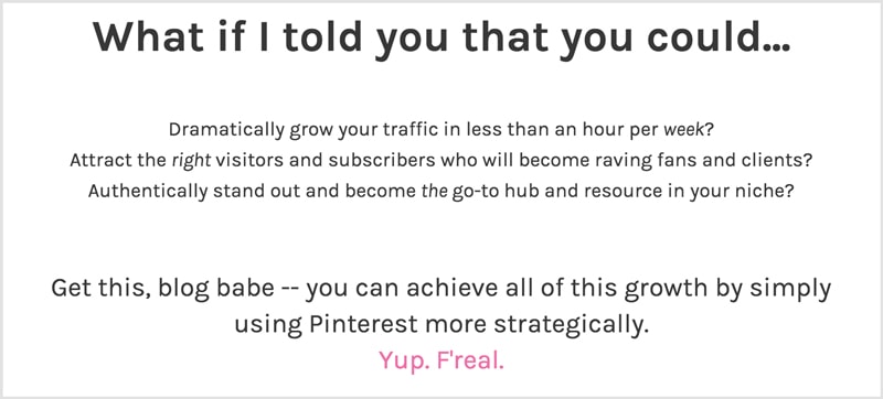
Of course, you will want to include much more than just what I’ve shared in the image above. Be exhaustive of the benefits of your product, but also make sure that you’re not being repetitive or robotic. Bottom line: aim to convey the value of your product.
3. Case studies or results
Rather than just throwing words at them, try to include a case study or an example of the results they can achieve if they follow your system. On my Pinfinite Growth sales page, I include screenshots of the growth I saw in my audience by using the same strategies in the course. Here’s an example:
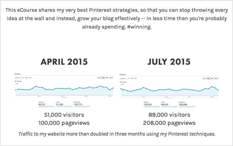
Screenshots work well for case studies, as they allow visitors to visualize the results they might achieve.
4. What they’ll learn from your product
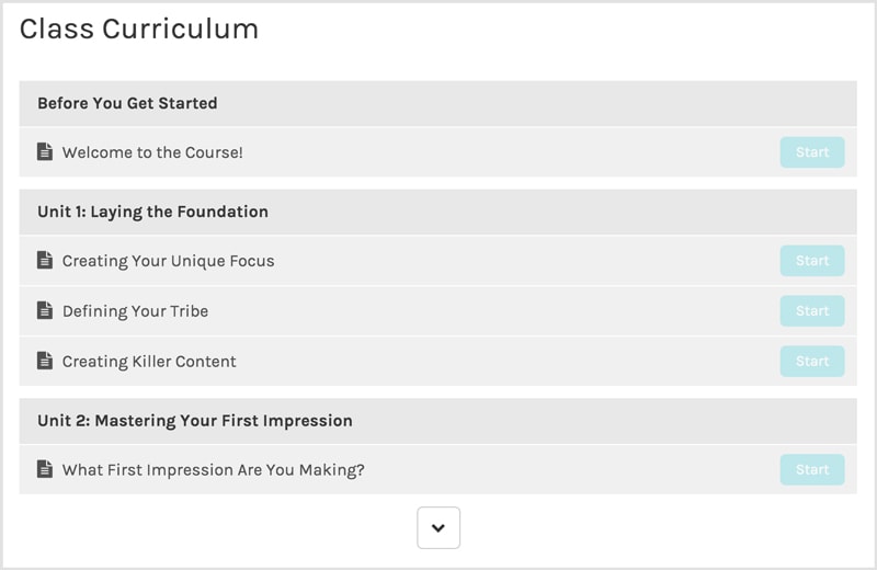
People are much more likely to purchase your product if you tell them exactly what they can expect to learn. If you’re creating an ebook, share the Table of Contents. If it’s an ecourse, let them know which modules they’ll be getting. Telling your audience what is in your product will also give them more confidence to say, “hey, those sound like things I need!”
I use a platform called Teachable, which allows you to (optionally) insert this nifty looking thing on your sales page, which includes the name of each of your lessons for everyone to see:
5. Testimonials or social proof
Social proof is HUGE. Before someone feels comfortable buying your product, they need to see that others have enjoyed your product already. We use social proof to make decisions almost everyday in our lives. We use Yelp to look up restaurant ratings before deciding where to eat. We base our Amazon purchases on which product has the highest and most reviews. Social proof is ubiquitous and you should include several testimonials in your sales page. Here’s an example of how I’ve displayed a testimonial on my Pinfinite Growth sales page:

That testimonial was emailed to me.
And here’s one from my Social Media Superhero sales page:
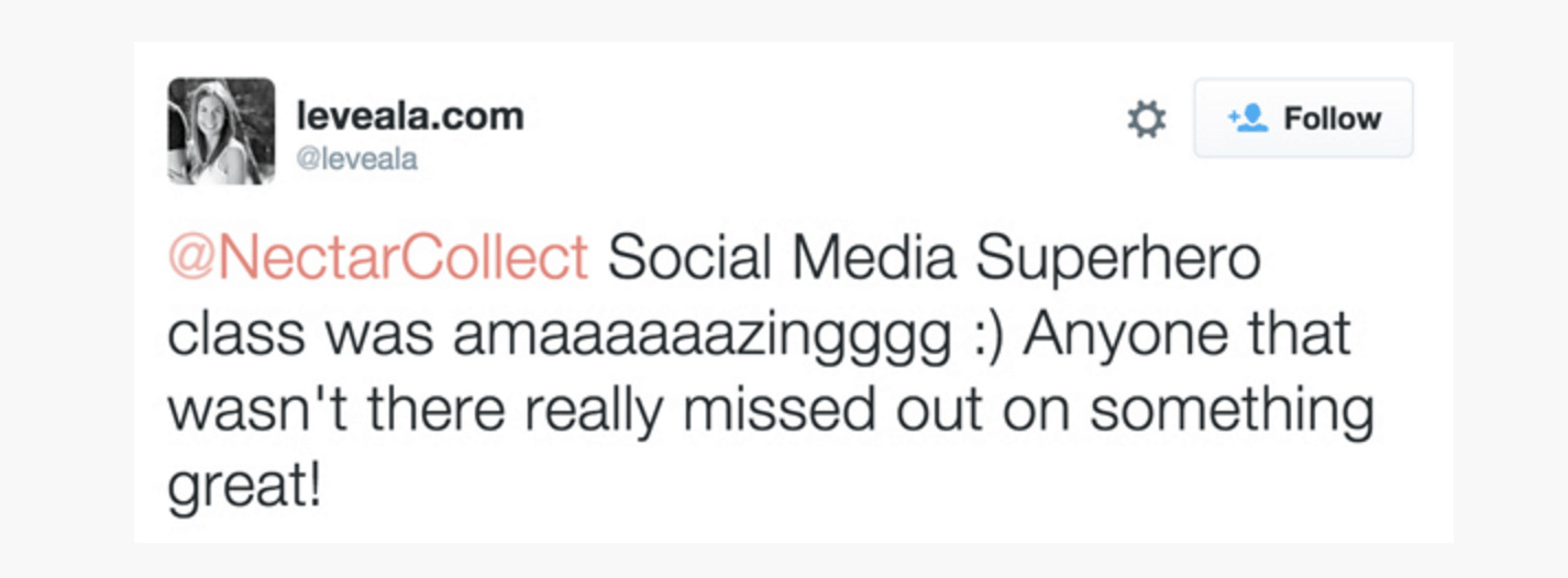
Clearly, that one I got off of Twitter.
Your testimonials can really come from anywhere — emails, tweets, Instagram posts or comments, blog posts, etc. If your customers are talking positively about your product, then you want to add that commentary to your sales page. I like to add photos of the testimonial giver because it’s easier for visitors to relate to their success when they can actually see what they look like (hey, she looks like one of my friends!), rather than simply reading a block of text. It feels more personal and relatable.
Also, make sure to follow up with customers later on to see if anyone has had a success story that they’d like to share — that would make the perfect testimonial!
BUT WAIT!
What if you don’t have any testimonials because your product is brand new?
Glad you asked, friend. In that case, you have a couple options:
- If you’ve ever sold services on a similar topic, you can reach out to past clients who can attest to your expertise on the topic. When I launched Pinfinite Growth, I reached out to past blog coaching clients for testimonials, as Pinterest was something we discussed during our coaching sessions.
- Have beta testers before your product launches! Beta testers are friends or peers who test out your product fo’ free in exchange for offering feedback and testimonials about your product. Also, if they love your product enough after testing it, then they may just become some of your biggest promoters during your launch!
6. Why you’re fit to teach this material
Selling info products is all about selling YOUR knowledge. You can’t hide behind the scenes around these parts, pal. In order for your students to truly believe that your product works, it helps to hear more about who you are and why you’re fit to actually be teaching this. What kind of results has this product produced in your own life? How did you get there? What benefits are you reaping now? What experience do you have overall?
Also, adding a friendly photo is always an A+ way to go. We want to see yo’ purdy face! 😀
7. Frequently Asked Questions
If you’re launching a new product, then you probably don’t have any FAQs just yet. 😉 Don’t fret, my pet. Now’s your chance to invent them! What kind of questions or objections do you think people may have about your product? Here are a few to get you started:
- How long do I have access to this material?
- Will I receive updates to the product in the future?
- What if I don’t like XYZ product?
8. A money-back guarantee
Yeesh. Offering a guarantee sounds a little nerve-wracking, especially for digital products where someone could easily buy it, use it, and then “return” it like some new-age con artist. Luckily, if you create a good product, then refunds will be extremely rare. I currently have more than 400 students. Want to know how many refunds I’ve been asked to give? 2. That equates to .05% or, in other words, HALF of ONE percent of students.
If you run your business with integrity by offering value to your followers, then it’s very unlikely that you’ll be barraged with people who sneakily buy your product just to use it and then get a refund. Don’t worry, friend!
On the other hand, imagine how much a money-back guarantee HELPS your sales. Without one, then you are basically telling your visitors that either you don’t trust them or you don’t trust the value of your product. Yikes. Build your customer relationships on trust from the get-go and you will create loyal fans and continuing customers. A guarantee gives prospects peace of mind so that they feel comfortable buying your product.
9. Enrollment buttons…of course!
Psh, like I even needed to include this. 😉
Even after adding your enrollment buttons, I highly recommend testing them. Before launching Pinfinite Growth, I was using a platform that made payment setup a little confusing. My sweet boyfriend helped me by purchasing the course to make sure my payment options were working. Guess what? They weren’t. 🙂 In total, I think he purchased it four times before we were able to figure out why it wasn’t working. Don’t worry, I refunded him! Moral of the story: test your payment options to ensure they actually work!

Pricing for your product
Ahh pricing. That pesky acquaintance who walks around like he owns the place. But really, pricing your product is a big decision and I know it’s perplexing for a lot of peeps out there.
Here are some things to consider:
- What format are you delivering your product? If it’s an e-book, then it will typically be worth considerably less than something like an e-course. Think back to college — one textbook was nothing compared to the tuition for an entire class.
- How much do similar products go for in your niche? Do a bit of research and see if you can find any trends.
- Bouncing off of #2, consider how much experience you have. Obviously, if your info product is less comprehensive than others like it, you will want your price to reflect that.
- Don’t sell yourself short. If you haven’t started yet, then keep track of how many hours you put into creating and launching your info product. It’s probably going to be quite a lot of time. Give yourself a reasonable hourly rate for your time and then start calculating how many hours you’ve worked and how much you should earn based on your hourly rate.
Finally, keep in mind that the perception of your price is important. If you underprice your product, hoping that it attracts more people to buy it because it’s “cheap,” then you’re actually repelling those people away because they’re assuming it’s “crappy.”
Imagine that you’re house shopping and every house that you like is in the $400,000 range. Then, you find one that has all the trappings of perfection and you excitedly ask how much it is. $100,000. Wait. Whaaaaa? Sure, it’s a great deal, but you’d probably pass it up because something so clearly underpriced causes us to assume there’s something wrong with it. Price your product so that people understand its value.
Here are a few general pricing suggestions (from my own personal opinion):
- Ecourses: $197-$997 (But I’ve seen these go all the way up to $2k!)
- Ebooks: $15-$50
- Live online workshops: $47-$197
- Physical Books: $8-25
- Membership sites: $10-50/monthly
Sales page tech suggestions
Before you can create your killer sales page, you need something to create it with! Here are a few awesome products or tools to help you create a sales page that sells itself:
1. Leadpages
Leadpages is awesome because it comes with a bunch of templates right out of the box, which are easily customized in their editor. No coding required! You could probably create an awesome sales page in Leadpages in about 30 minutes, which is much faster than most other options would take. Leadpages also allows you to create other types of landing pages, such as opt-in pages, webinar pages, and thank you pages. It’s something I use (and love!) on at least a weekly basis.
By the way, if you click the image below to download the free checklist, you’ll see a box popup where you can subscribe to download it. That box was created in Leadpages in about 3 minutes. Sexy.
2. OptimizePress
This is not something that I have personally used, but I’ve heard good things about it from others! OptimizePress has a fairly inexpensive, one-time fee, and comes with the capablities for you to build TONS of different types of pages with relative ease. From sales pages to webinar registration pages to membership portals, it’s very robust and starts at $97.
3. Teachable
If you’re creating an online course as your info product, then I highly recommend signing up for Teachable. Teachable is the platform I use to host all of my own courses and workshops and I absolutely love it! The main purpose of this platform is to run your courses and membership areas, but it does also include a drag and drop sales page for each of your courses, which is easy to create. You can check out a sales page I made on Teachable for my course, Pinfinite Growth, here.
4. Gumroad (kind of)
I say “kind of” because, while Gumroad allows you to sell products through their site, it doesn’t really have the capabilities for a full sales page. Rather, you will probably want to create a sales page elsewhere and send people to your Gumroad page (if you choose to use Gumroad) to actually purchase your product. That’s an option, but not a necessity.
5. A custom page on your website
If you are comfortable designing a custom website page (especially if you have experience with design or code), then you will have the most freedom if you create your sales page on your own website. For my first course, Pinfinite Growth, this is the route I ended up taking. It does take quite a bit of work if you want your sales page to really look professional, but it can be a very cost-effective route if you know how to design the page yourself.
I hope this post was helpful, my sweet infopreneur pal. I’ve got something exciting and extra helpful brewin’ for ya, so make sure to click the image below to sign up so that you’ll get to hear about it first. 😉
Let’s chat down below. What is one takeaway or action item you got out of this post?
Keep learning! >> Check out the final post in this series: How to Launch and Market Your First Info Product
